Thursday, March 31, 2011

Bright Done Right


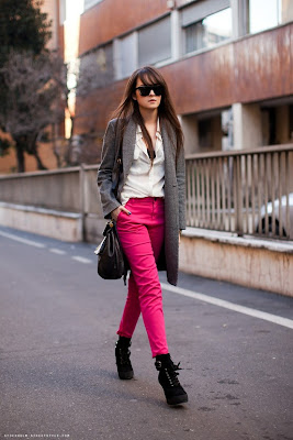
It seems that the first day of sunshine after a storm entices us all to slather on color as if it were our last attempt.  I find little pops of color to be more entriguing during the first bit of spring.  It sort of invites everyone to be cheery with you, and simultaneously builds anticipation for Palm-Springs-on-Memorial-Day color-swathed outfits.
When I'm wearing brighter colors, I'm drawn towards small pops of color versus all over bold hues.  It can be difficult to balance bold colors in an outfit in a chic, adult, yet playful way.  Here are a few of my favorite uses of color, in a fresh, current and vibrant way.  Kelly Wearstler would be proud.


 *photos: PrettyStuff, StockholmStreetstyle, SincerelyJules, 9to5chic


Wednesday, March 30, 2011

Firmly Grounded


Loving this trend. Chunkier heels ground the look more, and can make even a springy, effervescent sundress have more weight. The heavier proportions also tend to help out women with more muscular, curvier physiques - they don't contrast so sharply, the way a pencil-thin stiletto would. Brava!


* photos courtesy of TrendEnvy, AllthePrettyBirds, theSartorlialist


Tuesday, March 29, 2011

Labor Union


Sometimes design fads saturate the market too quickly. This often leads to half-hearted imitations and cheap overabundance. While there has been an ever-increasing use of occupational furniture in current interior design, here is a phenomenal example of one couple who has found their own voice within this design aesthetic. Beautiful marriage of texture, finishes, warmth and personality.
I can't manage to get behind the phenomenon of viewing magazines on tablets and smartphones...but in case you can, the entire printed article (seen first in California Home+Design Magazine, Sept. 2010) is now archived here on their website.